筑都新作丨串联科技之光——上海普陀创新里办公楼室内设计
更新时间:2024-07-12科技长廊——用一条“线索”贯穿分散的空间
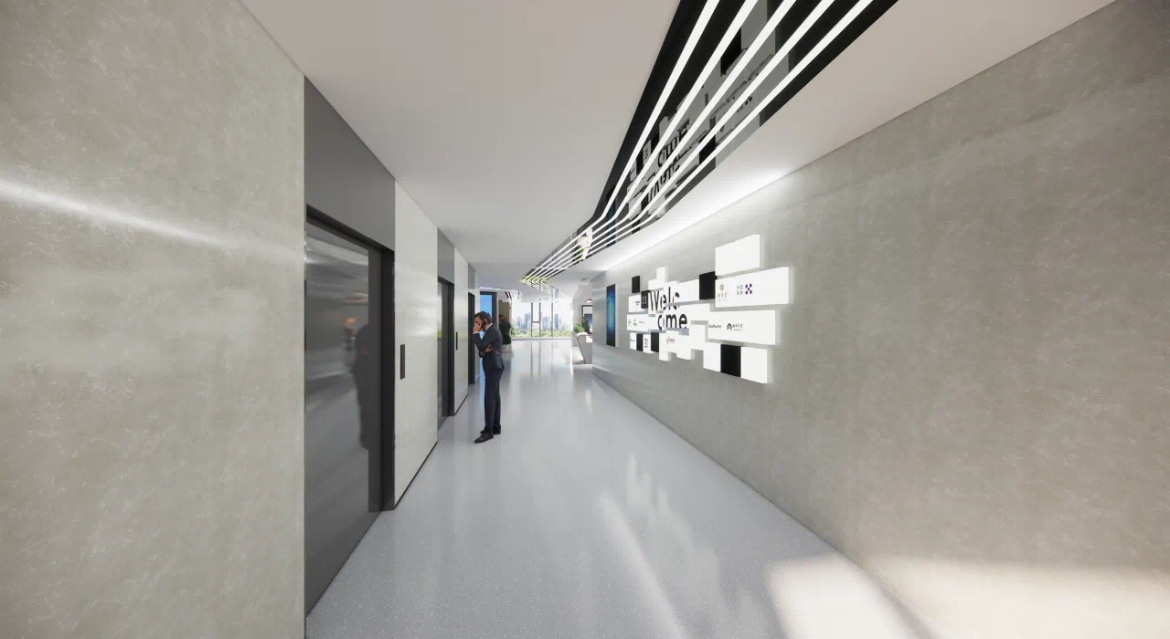
以四层为例,从电梯厅出来后首先进入公共空间,按照功能划分有前台、共享办公区、展示墙面、水吧、休息区、多功能厅、讨论室等空间,这些空间都分布在长条形走廊两侧,缺少整体秩序感。我们利用顶面灯光造型设计,形成一条曲折跑道形态的连续线条,从电梯厅一直延伸到北侧落地玻璃窗,并折返方向通往东西向的走廊深处。这样就让原本分散的空间有了一个统一的形式链接,这条灯带本身的材质、颜色选择,以及折线形形态,都很好契合了科技感主题。
Using the fourth floor as an example, upon exiting the elevator hall, one first enters a public space that is functionally divided into areas such as the reception desk, shared office area, display wall, water bar, lounge area, multi-functional hall, and discussion room. These spaces are distributed on both sides of a long corridor, lacking a sense of overall order. We utilized ceiling lighting design to create a continuous, winding track-like line that extends from the elevator hall to the floor-to-ceiling windows on the north side and then changes direction to lead to the east-west corridor. This design provides a unified form connection to the originally scattered spaces. The material and color choices for the light strip, as well as its zigzag shape, effectively match the technological theme.

时光隧道——科技感多功能厅
多功能厅位于四层,是开放供所有办公人员使用的场所,兼具会议、研讨、发布等多重功能。我们在设计上充分考虑整体空间定位和使用者行业属性,着力营造科技感氛围。侧墙面、顶面、舞台空间全部采用白色材质,墙顶交接处用圆角过渡,再辅以线形灯带,由顶面延伸至墙面并自然收束闭合,空间整体性非常强。
The multi-functional hall is located on the fourth floor and is an open space available for all office personnel. It serves multiple purposes, including meetings, seminars, and presentations. In the design, we fully considered the overall spatial positioning and the industry attributes of the users, aiming to create a technological atmosphere. The side walls, ceiling, and stage area all use white materials, with rounded transitions at the wall-ceiling junction. Additionally, linear light strips extend from the ceiling to the walls and naturally converge, creating a strong sense of spatial integrity.

人性化空间与家具配置——中、小型会议室
小型会议室采用圆角会议桌,供4-5人使用,对空间进行了充分利用。中型会议室采用V字形会议桌,保证了所有使用者观看屏幕有相同的便利性。这都是以空间条件为参照进行家具配置的范例。
The small meeting room uses a rounded conference table for 4-5 people, making full use of the space. The medium meeting room employs a V-shaped conference table, ensuring that all users have equal convenience in viewing the screen. These are examples of furniture configuration based on spatial conditions.

仪式感空间——五层、六层入口区域设计
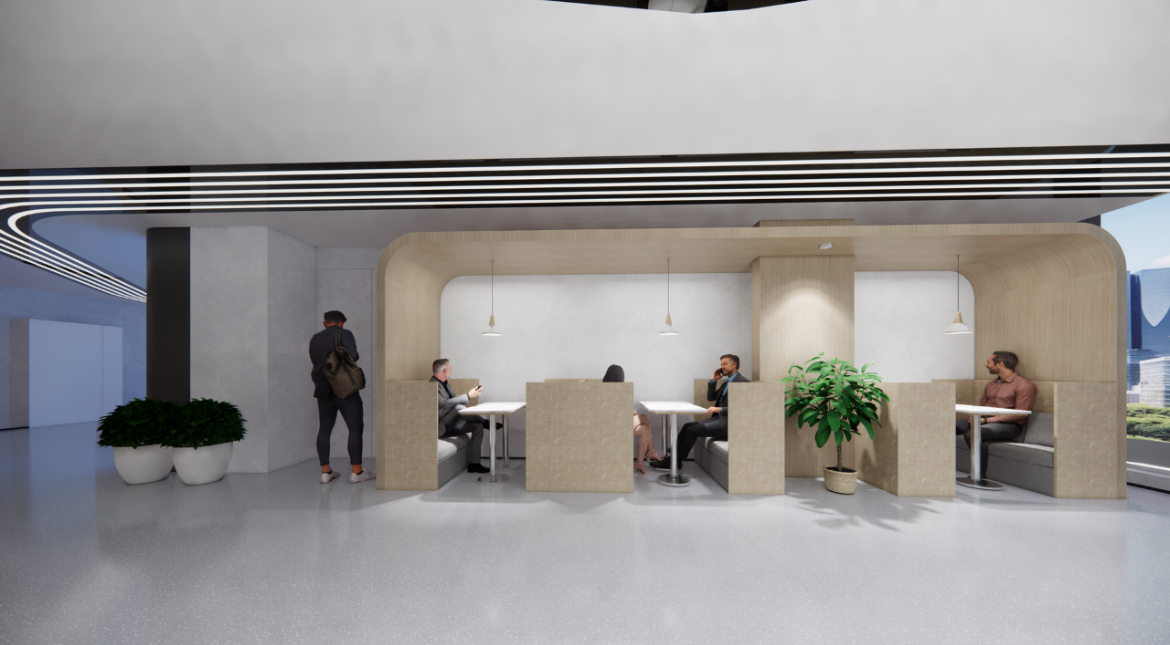
四层公共区域面积较大,我们进行了充分的差异化设计,而五层、六层公共区域非常有限,如何在这样的条件下营造必要的入口仪式感空间呢?在五层正对电梯厅的区域,设计公共休息、讨论区,并设置丝网印刷玻璃隔断,既保障了讨论区的相对隐私性,又为出电梯厅的人流提供了一面天然的背景墙。
在六层则利用墙体的厚度挖出一个壁龛,用以悬挂装饰画或科技艺术品实物,这便是六层的背景墙。
The public area on the fourth floor is relatively large, allowing for extensive differentiated design. However, the public areas on the fifth and sixth floors are very limited. How can we create the necessary sense of entry space under such conditions? In the area directly facing the elevator lobby on the fifth floor, we designed a public rest and discussion area and installed a silk-screen glass partition. This ensures relative privacy for the discussion area while providing a natural background wall for the flow of people exiting the elevator lobby.
On the sixth floor, we utilized the thickness of the wall to create a niche for hanging decorative paintings or technological art pieces, serving as the background wall for the sixth floor.
统一秩序中的个性表达——办公单元前台空间设计
除了公共空间之外,其他所有使用面积均被分割为大小不一的办公单元,以供不同规模的企业使用。因为采用统一装修、邀请入驻的运营模式,不可能对每个办公单元都进行全面个性化的设计。我们对每个办公单元的前台区域进行重点设计,采用原色铝板进行墙面、顶面的装饰,形成了“金属盒子”的视觉感受,再辅以线形灯光,充分体现科技感主题。
在此基础上,各个办公单元因其面积不同、入驻企业不同,有不同的logo设计,以及一些个性化的细节设计。整体呈现出统一中的个性化,用最小的成本实现了最佳的效果。
Apart from the public spaces, all other usable areas are divided into office units of varying sizes to accommodate different scales of enterprises. Due to the uniform renovation and invitation-based occupancy model, it is not possible to carry out comprehensive personalized design for each office unit. We have focused on the design of the reception area of each office unit, using raw aluminum panels for wall and ceiling decoration to create a "metal box" visual effect, complemented by linear lighting to fully reflect the technological theme.
On this basis, each office unit has different logo designs and some personalized detail designs due to their different sizes and the different companies that occupy them. The overall presentation achieves personalization within a unified theme, realizing the best effect at minimal cost.